Productive Drapery [with Annie Coggan]
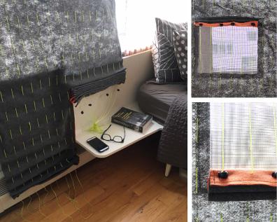
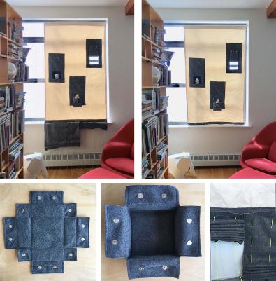
The Productive Drapery project is a multidisciplinary investigation intended to correct architecture and create better interiors. Historically drapery has been utilized to block and filter light, provide privacy, and mend construction to minimize drafts.
We continue to develop a taxonomy of conditions that address the pragmatics of drapery via analogue and digital methods. This praxis research is an extension of the theoretical inquiries found in the expanding body of knowledge for Interior Design. Through the manipulation of prototypes, we test pedestrian ideas of domesticity and create new textile based interiors. Fabrication methods encompass, hand sewing, machine sewing, smocking, folding, pleating, and embroidery. Materials include, various textiles including, woven, knit, and felted as well as conductive thread, thin film photovoltaic and smart textile assemblies.
The Productive Drapery prototypes provide context for window treatment beyond the decorative, adapting to frame views, compressing and expanding to meet changing spatial and climatic conditions. Illuminating Curtaining’s historically performative role also questions issues of home goods consumption. In combining the tasks of decorative objects; lights/curtains, picture frames/curtains, these prototypes provide an edited cohesive environment extending the definition of interiority and human habitation.
Embedded Portrait: Digitally Induced Bespoke Moulding
The current and evolving generation of digitally induced, industrially produced, mass customizable yet bespoke products can at once be one-of-a-kind, aligned with preference and taste, and fabricated to precisely fit the architectonic of the
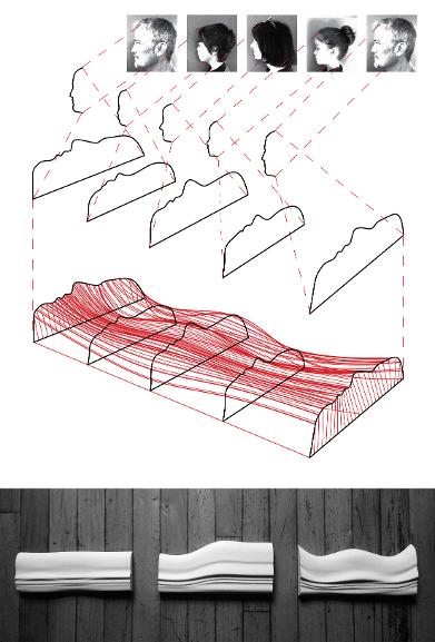
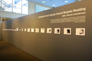
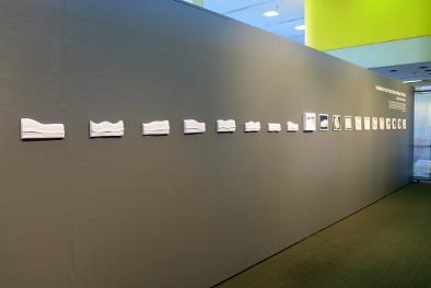
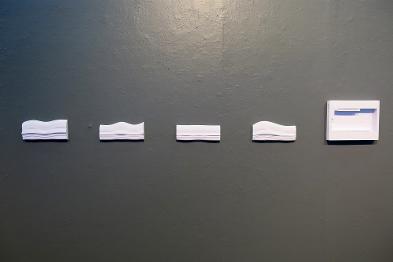
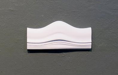
Digital fabrication technologies have made possible a more individualized, serially produced interior with products that can be considered bespoke. The embedded portrait series rethinks decorative ornament as a reflection of the inhabitants of an interior environment, defined as dynamic profile moulding that is derived from the profiles of the inhabitants, present and/or past. The modules can me matched in multiple permutations to form a non repetitive installation.
Until recently the modularized prefabricated interior has been customizable to meet function and interior architectural fit—as well as individual taste—only to a limited degree because by nature the outcome of the modular kit is largely predetermined. The current and evolving generation of digitally induced industrially produced mass-customizable yet bespoke products can at once be one-of-a-kind, fabricated to precisely fit the architectonic of the interior, and can even be made-to-measure to the body of the inhabitant. In the production of interior products, this means that products and environments can be manufactured serially, while having the capacity to be tailored individually.
The moulding modules are digitally printed on an M-Core printer which constructs the element by cutting and gluing layers of standard white copier paper.Exhibit photos from Embedded Portrait exhibit at University of Tennessee Knoxville, Photographs © Diane Fox
Zigzag . Metro Show Art Fair . New York
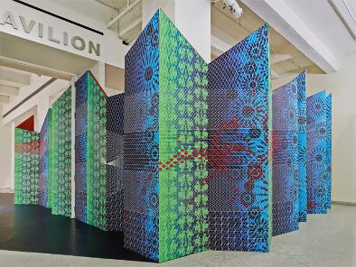
Zigzag is a temporary installation designed Igor
Siddiqui of the Austin-based ISSSStudio, in collaboration with Deborah
Schneiderman of the Brooklyn firm deSc. Commissioned by the Art Fair Company
for the annual Metro Show at the Metropolitan Pavilion in New York City, Zigzag
served as the main entry point into the fair and provided the visitors with a
memorable first impression of the event.
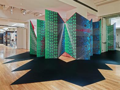
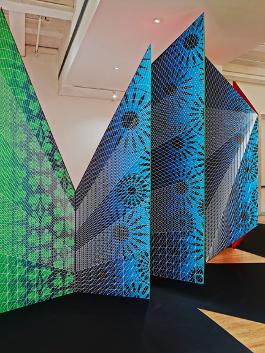
The installation’s main element is a continuous 100-foot long zigzag wall, clad
in custom wallpaper that abstractly references the exhibition’s diversity of
content. On the floor, matte-black vinyl–cut in the shape of the shadow that
the wall would cast if sun-lit–defines one’s sense of arrival to the Metro
Show. The installation’s faceted panels, the back of which is constructed from
bright red hand-painted canvas, also create a more intimate guest lounge
furnished by the prominent online vintage retailer V&M.
Using rules of perspective, the design playfully engages visitors by offering
an ever-changing visual experience based on movement and point of view. The
graphic wallpaper invites the users to construct their own connections between
what may be traditional and whatis contemporary–not unlike the content of the
fair itself. Designed digitally in its entirety, the project explores how new
technologies are redefining the role of pattern and decoration in the
contemporary interior. Unlike conventional wallpaper, which is ultimately based
on repetition, every square-inch of Zigzag’s surface is uniquely customized to
fit the geometry of the angular panels and reflect the specificity of the
context
Photographs © Frank Oudeman
Poché: The Space Between
In their design process the Pratt Team looked first to the host city itself, Chicago. We were enamored with the intense sculpture of the structural skyline. Because we are interior designers we read these great buildings not only as imposing envelopes, but more so for the human experiences, lives, work, and play, that they allow to unfold within. We saw this as a typology of space between, a poché between scales of urban exterior, building interior, and the human.
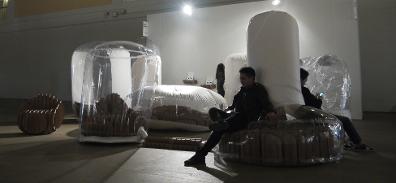
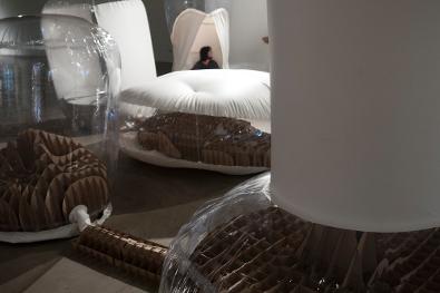
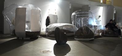
Pratt’s 2016 SOFA Connect Lounge is an exploration of this concept of poché between scales. Using white, silver, and transparent vinyl in combination with recycled cardboard the team has constructed an occupiable architectonic rendering of an urban city skyline. The design itself is comprised of a series of pre-fabricated inflatables evocative of a cityscape.
This initial perception of urban scale is directly challenged, however, by user occupation of these structures. As interior designers traditionally concerned with the human scale, we co-opted these structures to become understandable at the scale of the body.
The installation was created by a team of faculty and students from Pratt Institute for the SOFA Connect 2016 installation at Navy Pier in Chicago.
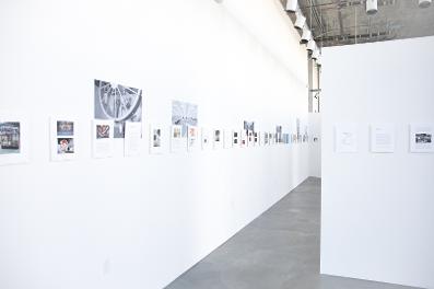
Interiors Beyond Architecture Exhibit Hubble Street Gallery
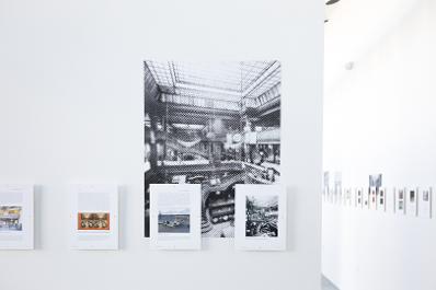
Interiors Beyond Architecture proposes an expanded impact for interior design that transcends the inside of buildings, analysing significant interiors that engage space outside of the disciplinary boundaries of architecture. It presents contemporary case studies from a historically nuanced and theoretically informed perspective, presenting a series of often-radical propositions about the nature of the interior itself. Internationally renowned contributors from the UK, USA and New Zealand present ten typologically specific chapters including: Interiors Formed with Nature, Adaptively Reused Structures, Mobile Interiors, Inhabitable art, Interiors for Display and On Display, Film Sets, Infrastructural Interiors, Interiors for Extreme Environments, Interior Landscapes, and Exterior Interiors. Edited volume with Amy Campos.
Paper + Air
Paper + Air is based on the idea of a city as a place of constant change. The project considers the life of a city, unifying past, present, and future through forms that are found in the overlap between expansion and contraction. The elements are readily transportable without compromising spatial impact.
The environment is fabricated from two primary materials: paper, made spatial through parametric design, and air as inflatable form. We understand buildings are time-based and evolve slowly over generations. Inflatability can speed this process up to something a spectator can register.
The installation was created by a team of faculty and students from Pratt Institute for the SOFA Connect 2015 installation at Navy Pier in Chicago.
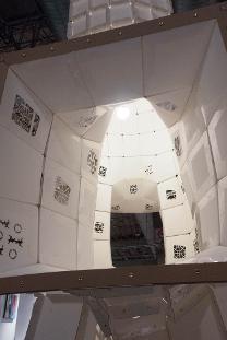
Call + Response . Connect Lounge . SOFA Expo . Chicago
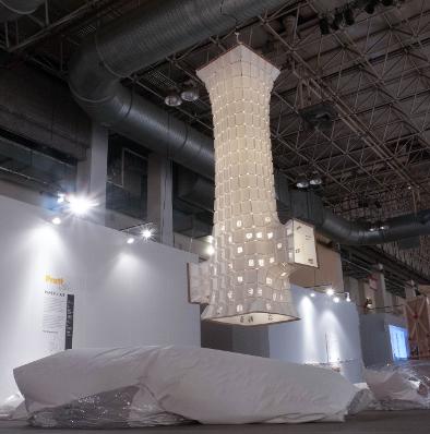
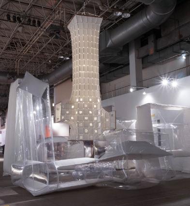
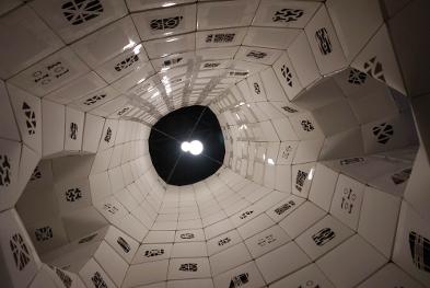
Inhabitation as a defining concern differentiates the approach to the design of the interior from other design disciplines. The interior exists and is activated by humans; it is a place of constant flux. The Pratt Call + Response lounge was conceptualized to heighten the experience of inhabitation by engaging SOFA visitors with the installation and offering a multi-sensory experience. The closer a visitor is to the installation, the more integrated into the constructed interior environment they become. The canopy creates an interior environment distinct from the rest of the exhibition. Jazz music, emanates from within the seats and under the large canopy is an integral aspect of this differentiated place. Faculty-Student Project.
The closer a visitor is to the installation, the more integrated into the constructed interior environment they become. The canopy creates an interior environment distinct from the rest of the exhibition. Jazz music, emanates from within the seats and under the large canopy is an integral aspect of this differentiated place.
Cloudspace . Connect Lounge . SOFA Expo . Chicago
The Pratt Connect lounge is designed by a team composed of faculty, undergraduate students and graduate students from the Department of Interior Design at Pratt Institute in Brooklyn, New York. The Pratt Interior Design Program is an architecturally oriented program with emphasis on spatial design.
The juxtaposition of the installation’s two elements, the canopy
and the seating, references SOFA Chicago’s objective of providing a market for
artists who are interested in combining traditional decorative arts with
functional objects. In addition to connecting the SOFA Chicago visitor to the
surrounding city, the environment seeks to create a connection between the SOFA
Chicago visitors
and the students of Pratt Institute. As noted above, seating arrangements are
designed to repurpose the discarded cardboard plotter tubes that amass in the
school’s print labs. The project will be built from approximately 300 of these
tubes.
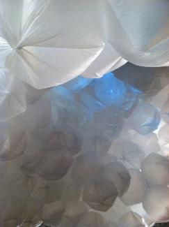
Interior Provocations Exhibit: Snapwall
Faculty led student project design/build installation for the third Interior Provocations Symposium at Pratt Institute. Student team: Jubin Bhatia,Beem Chansue, Aakanksha Gupta, Erin Loffler, Aishwarya Mundra, Alexandra Pinkerton, Tina Shi, Lucy Wang, Ziqian Wang, Ya Wen, Yanhong Yang.
Surtex Exhibit
The Surtex Exhibit at Jacob Javitz Center comprised work from Pratt Institute Interior Design program Options Labs. The Prefab interior interior lab work rethinks wallpaper with the foldable three dimensional spatial wall tile system (Instructor: deborah Schneiderman). The Soft Construction lab rethinks upholstery with with upholstered benches (Instructor: Annie Coggan).The exhibit also includes the Performative Curtaining Project (a design collaboration between Annie and Deborah Schneiderman). Performative Curtaining is a multidisciplinary investigation that intends to correct architecture and create better urban interiors. Historically curtains are understood to block and filter light, provide privacy, and mend construction by blocking gaps hence minimizing drafts.1 The development of the modernist plate glass window caused curtaining to be utilized to further “right” architecture. Large picture windows in the front façade of American tract homes were situated for the sake of symmetry but generated interiors that were imbalanced and difficult to inhabit, wall to wall curtaining was utilized to correct these issues.2 The advent of the urban glass tower with floor to ceiling glazing further exacerbated this problem. The task of Performative Curtaining addresses and rectifies such urban interior issues caused by large expanses of glass as well as obstructions caused by HVAC systems typically found in pre-war apartment buildings.
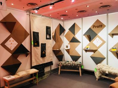
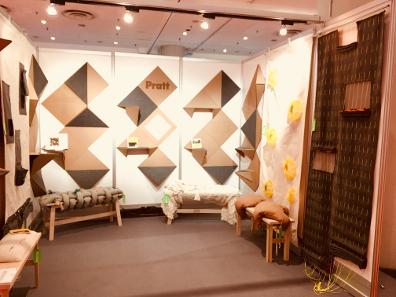
Frame the Prefab Interior . Storefront for Art and Architecture .
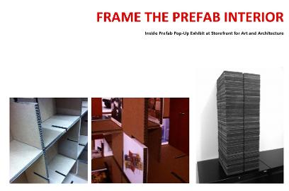
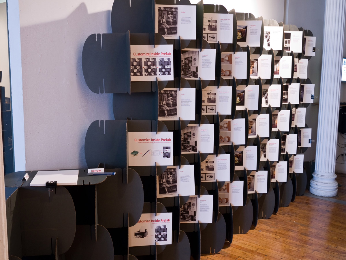
Inside Prefab introduces the topic and establishes the history of the prefabricated interior environment. Though prefabrication in architecture is well defined, there has been virtually no pointed discussion on prefabrication specifically within the interior. There is however an abundance of evidence regarding the prefabrication of the interior environment dating back thousands of years and most significantly from the lat 19th century to the present. Exhibit for Inside Prefab: The Ready-Made Interior.
Modular Shelving . Functional Installation at the Navy Pier
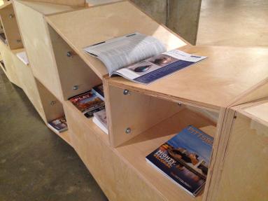
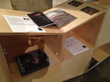
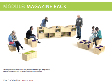
This proposal was generated with students at Pratt Institute and was inspired by the idea of a module; a system which may allow for mobility, flexibility, and durability. Our aim was to develop a modular system that could be easily assembled into different furniture configurations, as required, and providing space for seating, storage, display, and branding, by using surplus and sustainable materials, and a simple and economic assembly.
The module was designed from an 18"x18" x18" cube; its dimensions optimized to provide the proper heights for seating, working surfaces, and to easily display information and products. The design of the individual module resulted from a variety of parameters. Added slots for carrying and displaying t-shirts, a series of holes to put together, a 15 degree slant on one side for displaying magazines and create interesting arrangements, and the addition of a layer of felt that helps to bring texture and color into the system, while creating a reveal between individual modules. A solid face conceals the contents stored and provides a smooth surface for graphics and other branding needs.
The modules can be arranged in different ways depending on the required function. Two modules can be assembled horizontally to become a seat, or a bench, or a side table. Two or more can be stacked vertically to become podiums, or storage, or display systems. A combination of assembling and stacking provides larger multi-directional configurations, some of which become the magazine racks, t-shirt and catalogue counter and information desks needed. But ultimately, the module is a flexible system that can be utilized in varying ways; growing and expanding to accommodate any future need, thus enabling the system to be used time and time again.
Inside Prefab introduces the topic and establishes the history of the prefabricated interior environment. Though prefabrication in architecture is well defined, there has been virtually no pointed discussion on prefabrication specifically within the interior. There is however an abundance of evidence regarding the prefabrication of the interior environment dating back thousands of years and most significantly from the lat 19th century to the present. Exhibit for Inside Prefab: The Ready-Made Interior.
Photographs © Scott Lizama
Ricco/Maresca Gallery
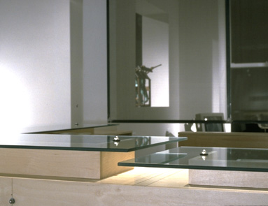
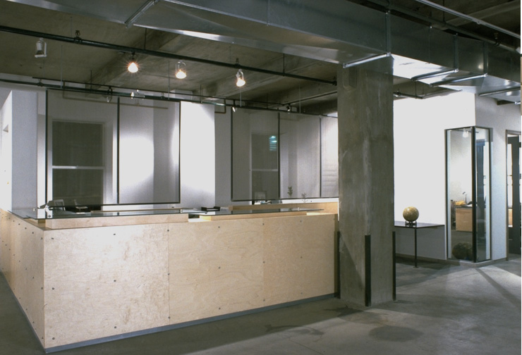
A 6000 sq. ft space in Chelsea, NYC,
Ricco/Maresca Gallery is one of the premier galleries for Outsider Art and
American Folk Art in the US. The Materials are a combination of recycled
products, off the shelf plywood, industrial straining materials, and galvanized
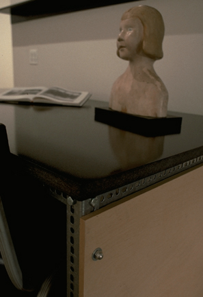
metals. The focal point reception area highlights floating glass countertops
which double as book and catalogue display. Ceiling hung steel angle and steel
fabric partitions filter light through the space while allowing managers visual
privacy and auditory control.
Photographs © Scott Lizama
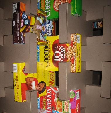
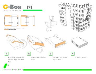
The S3 Sustainable Slotted System is the result of a collaborative Senior Interior Design studio project at Arizona State University. The solution, a slotted prefabricated modular wall system, is a fun and creative way to make interior partitions that are basic enough that most people can build them themselves. The wall system is devised to appeal to a broad population regardless of socioeconomic status, offering multiple material options and cost alternatives. The shapes are inspired by, or made from, everyday products such as tissue or cereal boxes. . Easily assembled and lightweight, the S3 Sustainable Slotted System is portable, adaptable, and reusable.
Kerrigan/Campbell Art + Projects
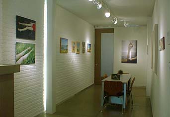
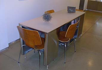
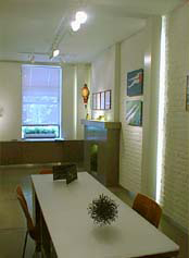
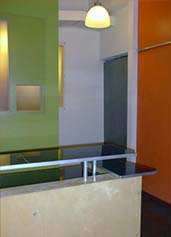
Design for the 400 sq. ft. Kerrigan Campbell Art + Projects met the challenge of creating a spacious feel in an extremely small space. Although the space is tight it is detail oriented. The primary design elements include the floor, created of custom 4’x4’ moisture resistant MDF tiles; the mantle, radiator cover, and pocket door are also made from the same MDF material. Folded steel columns/cove lighting fixtures cover the existing hot water pipes. The desk is custom fabricated from stainless steel and designed to be functional for two partners to work and meet with clients in a space that is only 8’ wide
.
.coms
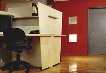
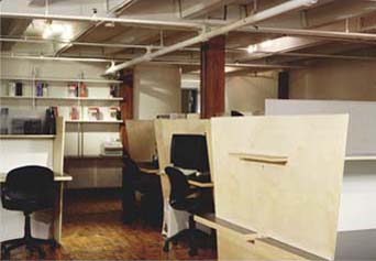
The primary no-waste concept for the design was based in the natural dimension of the framing system and material dimensions. The multiple ganged interior windows are arranged within the 16” on center standard framing of the new walls, with floating acrylic panels sized on sheet dimensions. The open office partition system, based on the 5’ x 5’ size of the Baltic birch plywood and recycled desktop material, allows light to filter through the space with translucent infill. Partition walls are panels of exposed patterned sheetrock. The doors, pattern sanded and sealed, are all galvanized steel fire doors installed both on their standard frames and as sliding factory type doors.
R/GA Study Center
The 2000 sq. ft. space was created to make this important and well published collection of Outsider Art accessible for scholarly research. The facility is situated in one of the main gallery buildings in Chelsea, NYC. The design was inspired by the library stack and carol system of University libraries. The galvanized slotted steel angle and astro-turf stack system allows the pieces to be both safely stored and on view at the same time. Arrangements can also be easily reconfigured to suit the needs of the rotating collection.
Photographs © Scott Lizama

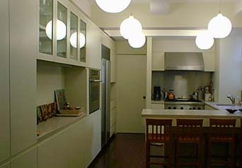
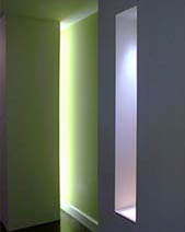
The project, designed in collaboration with Tsao & McKown Architects, encompassed the design for a gut renovation and build-out of a 2000 sq. ft. apartment. The interior incorporates contemporary design elements into the traditional design features of a Pre-War NYC building. The apartment was designed to incorporate the amenities of modern living and to maximize space where working folds away into previously unused pockets. Natural stone, pigmented concrete, silver leaf, light niches, and custom cabinetry are installed throughout to create an even balance of comfort and utility.
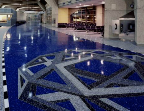
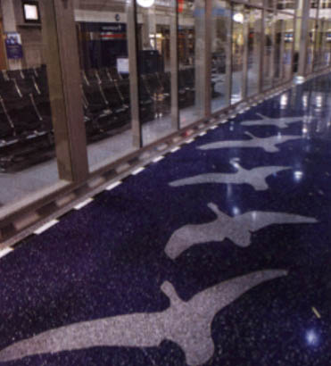
Kansas City International Airport / Terrazzo Floor
The 180000 sq. ft. of non-repetitive terrazzo floor was designed in collaboration with artists Kristin Jones and Andrew Ginzel. The flooring is installed on the ground level of the three terminals of the Kansas City International Airport. Inspired by the concept of past, present and future, the non-pattern incorporates sequences of arrows as the primary element. The arrows transition through space to facilitate perception of the change through time. The secondary imagery of brass, stone and mosaic is pushed through space and time by the motion of the arrows.
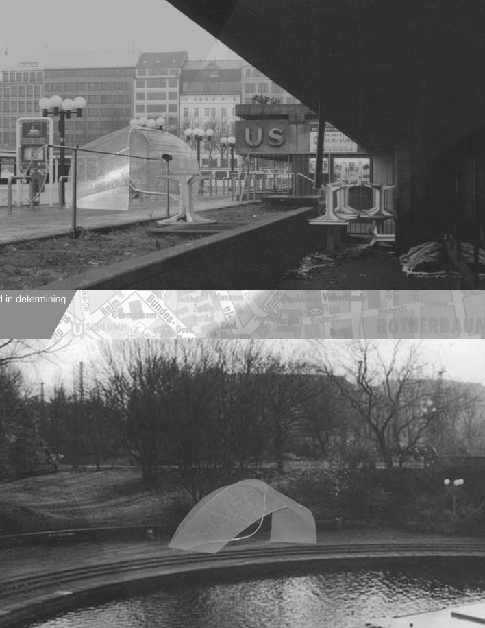
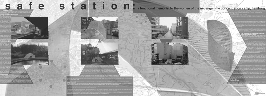
Safe Station
Safe Station is an inhabitable memorial meant to reconsider the object of memorial. Rather than a memorial to be visited, Safe Station is an everyday life experience. Program, function and design were determined by the everyday experience described in the writings of women Holocaust survivors. Each station provides shelter, orientation, communication and hydration. The shelters are available to provide for anyone who finds themselves in need. The form of the undulating glass station is a portion of a mobius strip, representing the infinity of the statement “never forget”. Safe Station was created specifically for an exhibition in Hamburg, Germany.
